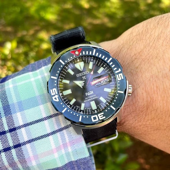
Every so often, I’ll film a review and just leave it unpublished for weeks. Occasionally weeks turn to months, and in this case months turned to years. That is the case with the SRPE27 – I filmed this over a year ago. And yes, that’s probably indicative of my feelings on the watch. Meh.
The video review isn’t all that impressive, and this written review won’t add much. The watch is fine, but I just don’t connect with it. When parted out, I really enjoy most aspects of the design – but I don’t find it to be the sum of its parts. It feels a bit to me like a design by committee – every aspect that catches my attention is well executed in isolation, but not cohesive in final design.
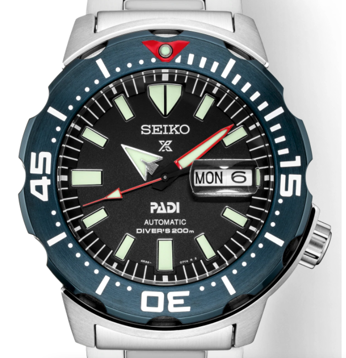
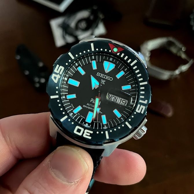
Take, for example, the bezel – probably the first and most distinguishing aspect of this watch. The subdued blue is eye-catching, but still somehow subtle. Even the brushed texture is done incredibly well, and the blue has an almost iridescent or sunburst effect in certain lights. It’s a beautiful shade of blue that perfectly ties in the PADI element to Seiko’s classic ocean vibe. So, big plus right? Not quite. Individually, it’s great. But when you throw it on a steel case, cage it between a steel half-shroud and add a black dial…it starts to feel a bit like a FrankenSeiko.
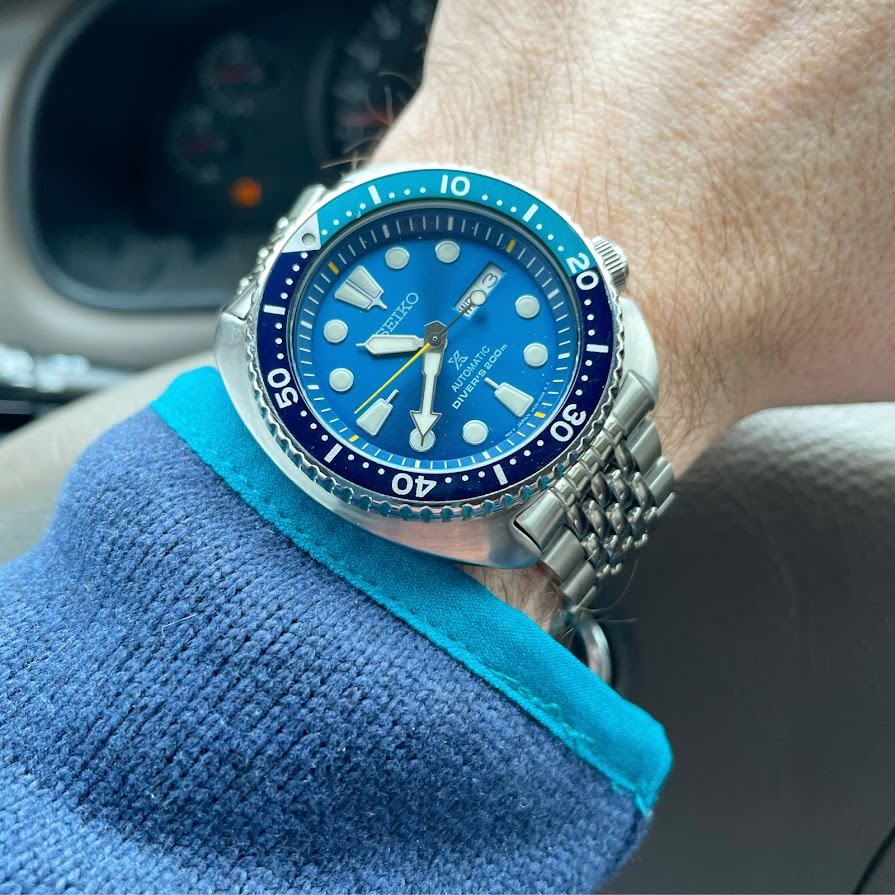
One more example would be the red highlights, something I generally really appreciate in Seiko divers. Think about the SKX series, or something like the “Blue Lagoon” Turtle. The small hits of orange on the dial, or the yellow second hand/minute markers, really add a subtle “pop” to the watch – it’s just enough to add something, but doesn’t distract from the overall appearance:
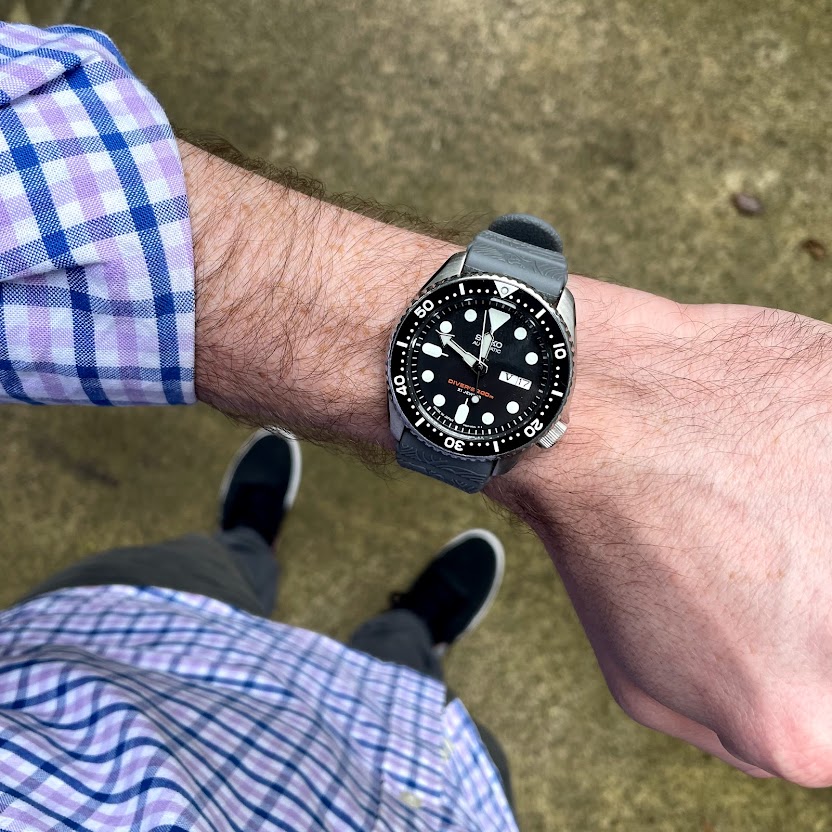
However, I don’t find the same to be true on the PADI Monster, and it’s really frustrating because it’s so close to perfection. If they had just done the second hand in red, or even the second hand and 12:00 triangle, I think it would have looked great. However, what’s going on with that minute hand?! It just throws everything off to me. I think every other Monster combination I’ve seen has the same style minute and second hand. I do understand the need to visually distinguish the PADI series, but…come on.
I started to write a paragraph about my feelings on the “candy bar” cyclops, but it wasn’t family friendly. In short, I would be a happy man if I lived the rest of my days without seeing another.
On the positive side, I love the 20mm lug width and the lume is excellent as you might expect. I think the watch wears well on a nato, and I would probably have liked it even more on a bracelet (though it may have made the bezel even more garish). Not really a distinguishing factor as far as Seiko divers go, but it looks particularly good up against that blue bezel.
This is a cut for me.


